| 3.5. Web User Interface Overview | ||
|---|---|---|
 | Chapter 3. Configuration |  |
| 3.5. Web User Interface Overview | ||
|---|---|---|
| | Chapter 3. Configuration | |
This section provides an overview of how to use the web-based User Interface. We recommend that you read this section if you are unfamiliar with the FB2900, so that you feel comfortable with the design of the User Interface. Later chapters cover specific functionality topics, describing which objects are relevant, any underlying operational principles that are useful to understand, and what effect the attributes (and their values) have.
The web-based User Interface provides a method to create the objects that control operation of the FB2900. Internally, the User Interface uses a formal definition of the object model to determine where (in the hierarchy) objects may be created, and what attributes may exist on each object, so you can expect the User Interface to always generate valid XML. [1]
Additionally, the web User Interface provides access to the following items :-
By default, access to the web user interface is available to all users, from any locally connected IP address. If you don't require such open access, you may wish to restrict access using the settings described in Section 14.3.
The User Interface has the following general layout :-
Figure 3.1 shows the main menu when it is set to display horizontally. Note that the main-menu items themselves have a specific function when clicked - clicking such items displays a general page related to that item - for example, clicking on Status shows some overall status information, whereas sub-menu items under Status display specific categories of status information.
The user interface pages used to change the device configuration are referred to as the 'config pages' in this manual - these pages are accessed by clicking on the "Edit" item in the sub-menu under the "Config" main-menu item.
The config pages utilise JavaScript for their main functionality ; you must therefore have JavaScript enabled in your web browser in order to configure your FB2900 using the web interface.
The following aspects of the user interface layout can be customised :-
Additionally, you can choose to use the default fonts that are defined in your browser setup, or use the fonts specified by the user interface.
These customisations are controlled using three icons on the left-hand side of the page footer, as shown in Figure 3.2 below :-
The first icon, an up/down arrow, controls the banner size/visibility and cycles through three settings : full size banner, reduced height banner, no banner. The next icon, a left/right arrow, controls the menu strip position and cycles through three settings : menu on the left, menu on the right, menu at the top. The last icon, the letter 'A', toggles between using browser-specified or user-interface-specified fonts.
Layout settings are stored in a cookie - since cookies are stored on your computer, and are associated with the DNS name or IP address used to browse to the FB2900, this means that settings that apply to a particular FB2900 will automatically be recalled next time you use the same computer/browser to connect to that FB2900.
It is also possible to configure an external CSS to use with the FireBrick web control pages which allows a great deal of control over the overall layout and appearance. This can be usful for dealers or IT support companies to set up FireBricks in a style and branding of their choice.
The structure of the config pages mirrors the object hierachy, and therefore they are themselves naturally hierachical. Your postition in the hierachy is illustrated in the 'breadcrumbs' trail at the top of the page, for example :-
Firewall/mapping rules :: rule-set 1 of 3 (filters) :: rule 7 of 19 (ICMP)
This shows that the current page is showing a rule, which exists within a rule-set, which in turn is in the "Firewall/mapping rules" category (see below).
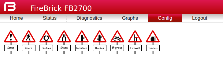
Configuration objects are grouped into a number of categories. At the top of the config pages is a set of icons, one for each category, as shown in Figure 3.3 :-
Within each category, there are one or more sections delimited by horizontal lines. Each of these sections has a heading, and corresponds to a
particular type of top-level object, and relates to a major part of the configuration that comes under the
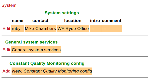
selected category. See Figure 3.4 for an example showing part of the "Setup" category, which
includes general system settings (the system object) and control of system services (network services provided by the FB2900, such as the web-interface
web server, telnet server etc., controlled by the services object).
Each section is displayed as a tabulated list showing any existing objects of the associated type. Each row of the table corresponds with one object, and a subset (typically those of most interest at a glance) of the object's attributes are shown in the columns - the column heading shows the attribute name. If no objects of that type exist, there will be a single row with an "Add" link. Where the order of the objects matter, there will be an 'Add' link against each object - clicking an 'Add' link for a particular object will insert a new object before it. To add a new object after the last existing one, click on the 'Add' link on the bottom (or only) row of the table.
If there is no 'Add' link present, then this means there can only exist a limited number of objects of that type (possibly only one), and this many already exist. The existing object(s) may have originated from the factory reset configuration.
You can 'push-down' into the hierarchy by clicking the 'Edit' link in a table row. This takes you to a page to edit that specific object. The page also shows any child objects of the object being edited, using the same horizontal-line delimited section style used in the top-level categories. You can navigate back up the hierarchy using various methods - see Section 3.5.3.
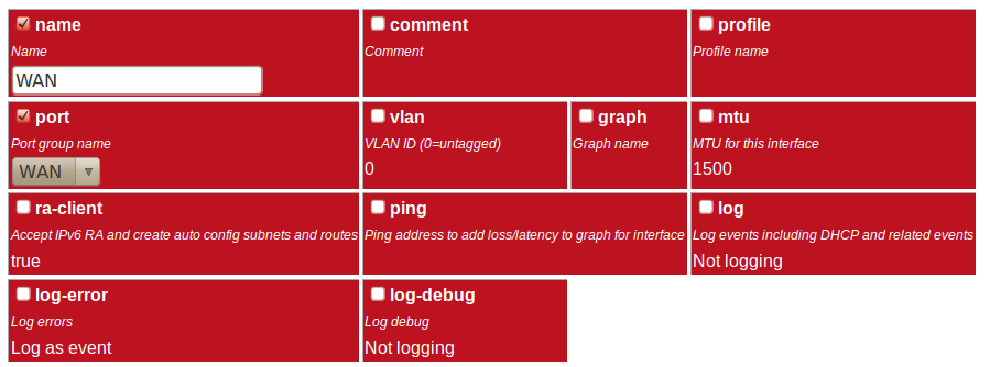
The details of an object are displayed as a matrix of boxes (giving the appearance of a wall of bricks),
one for each attribute associated with that object type. Figure 3.5
shows an example for an interface object (covered in Chapter 6) :-
By default, more advanced or less frequently used attributes are hidden - if this applies to the object being edited, you will see the text shown in Figure 3.6. The hidden attributes can be displayed by clicking on the link "Show all".
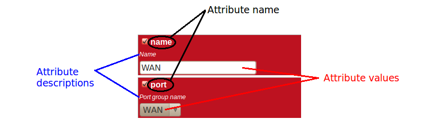
Each brick in the wall contains the following :-
These can be seen in Figure 3.7 :-
If the attribute value is shown in a 'strike-through' font (with a horizontal line through it mid-way vertically), this illustrates that the attribute can't be set - this will happen where the attribute value would reference an instance of particular type of object, but there are not currently any instances of objects of that type defined.
Since the attribute name is a compact, concise and un-ambiguous way of referring to an attribute, please quote attribute names when requesting technical support, and expect technical support staff to discuss your configuration primarily in terms of attribute (and object/element) names, rather than descriptive text, or physical location on your screen (both of which can vary between software releases).
You navigate around the hierarchy using one or more of the following :-
The configuration pages are generated on-the-fly using JavaScript within your web browser environment (i.e. client-side scripting). As such, the browser is essentially unaware of changes to page content, and cannot track these changes - this means the browser's navigation buttons (Back, Forward), will not correctly navigate through a series of configuration pages.
Please take care not to use the browser's Back button whilst working through configuration pages - navigation between such pages must be done via the buttons provided on the page - "Prev", "Next" and "Up".
Navigating away from an object using the supported navigation controls doesn't cause any modifications to that object to be lost, even if the configuration has not yet been saved back to the FB2900. All changes are initially held in-memory (in the web browser itself), and are committed back to the FireBrick only when you press the Save button.
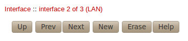
The navigation button area, shown in Figure 3.8, also includes three other buttons :-
If you Add a new object, but don't fill in any parameter values, the object will remain in existence should you navigate away. You should be careful that you don't inadvertently add incompletely setup objects this way, as they may affect operation of the FireBrick, possibly with a detrimental effect.
If you have added an object, perhaps for the purposes of looking at what attributes can be set on it, remember to delete the object before you navigate away -- the "Erase" button (see Figure 3.8) is used to delete the object you are viewing.
To back up / save or restore the configuration, start by clicking on the "Config" main-menu item. This will show a page with a form to upload a configuration file (in XML) to the FB2900 - also on the page is a link "Download/save config" that will download the current configuration in XML format.
[1] If the User Interface does not generate valid XML - i.e. when saving changes to the configuration the FireBrick reports XML errors, then this may be a bug - please check this via the appropriate support channel(s).
| |  | |
| 3.4. Data types |  | 3.6. Configuration using XML |

